The Art of Good UX
Like it or love it, there’s a shift happening in the world of UX. The user experience is becoming less round how the user moves around an interface, and more about what the user experiences. This transition from a GUI-obsessed UX community to one which focuses on the end result over the ‘working out’ is more important than ever. At a recent visual analytics community event, I raised the the argument that we consume the end result of a user experience than the user experience itself.
What does this mean for the data visualisation and visual analytics? Well, for the former, it means that the days of dashboards are approaching an end. Surprising, you might say, given that they only just came into widespread adoption. I’m so glad it’s finally been accepted that our clients expect good visualisation; they use this stuff on a daily basis in their personal life, so why should their various platforms at work continually disappoint? But it needs to go one step further: data visualisation has, up until now, just been a way of creating a user interface around otherwise relatively inaccessible data. UX has historically focussed on the how: how do I view my data? How do I visualise results? How do I access it in a user-friendly way?
Well, big news for you data viz guys: those days are over. It’s all about the what. What does the user want to see? How do I get them straight there? How do I use the advent of new technologies to ‘shortcut’ to the outcome?
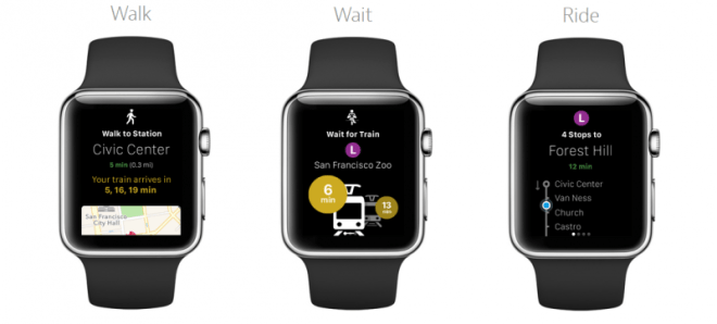
This is all the more important for anyone working in visual analytics. With the advent of smartwatches and wearables, for which to date analytics has been the heaviest focussed (read all the marketing material for Apple, Samsung, Pebble: it’s all ‘analytics lite’; ,much like how the original timepiece was intended), everybody will start needing to get their heads around how to visualise that on ever smaller screen real estate. Hint – it won’t be ‘making your graphs smaller’ (genuine suggestion from both Clik and Tableau). To get this right, you need only look at your friends over in the B2C market: see how CityMapper plan on using visual analytics to show only the information the user needs to see, when they need to see it. It’s time to make that jump: stop visualising train timetables; just show the user the platform they need to go to. Simple.
So what makes good UX? Well, to me it’s simple: understand the Art, not the Science. Stop looking at the how; stop identifying the psychologies of movement through the interface. In the new age of outcome-focussed UX, this approach will die. The Art, meanwhile, is beautiful. In UX terms, ask yourself this: How do you paint a picture that tells a thousand words? How do you present the minimum viable amount of data from the minimum viable input? How do you get the user experience to be more of an ‘experience’ and less of a logical methodology? How do you inject magic into visualisation? If you want answers to these, the science of UX won’t get you there; it’ll only help you streamline an existing process flow. But that shift is well underway, and it’s time for the key players to get their heads round it; it’s too compelling to ignore.


Interesting article though I’m struggling to see anything new here.
You open with User Experience now being about the experience rather than just the GUI, which doesn’t really make any sense. User Experience isn’t really that old and it has always been about the experience, it’s now just less about usability.
I also feel that the portion around it now being ‘what’ rather than ‘how’ effectively boils down to the age old point of “Content is king”.
You raise an interesting point about the challenges of presenting the minimum viable amount of information on a small screen, which is obviously a challenge with wearables. However, this is not really a new challenge, merely a progression. When internet browsing on mobile phones started to become commonplace it was a challenge to minimise input and output to the minimum when moving away from desktop screens.
All in all you comment on some key challenges, they just happen to be ones that people have been talking about for years.
LikeLike
Jon, I’m really grateful for your commentary – thank you. I completely agree, these are points which people have been talking about for a while, but I disagree that they have been to the scale you suggest. In the data visualisation and visual analytics space, as well as in many areas of businesses responsible for UX development, the obsession is on wire-framing and prototyping: focussing on the science and psychology, not the art.
LikeLike